graphic design
CASE STUDY 1: GALLERY LABEL SYSTEM
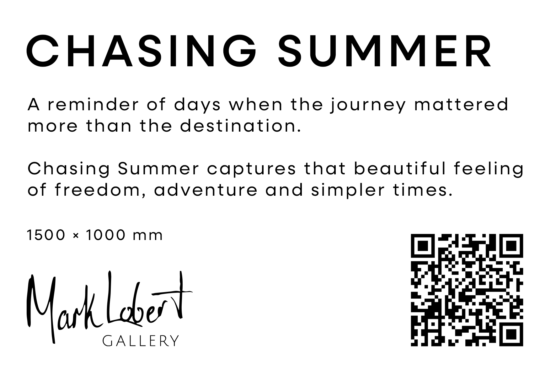
Brief: Design a label system that can be used in an art gallery to display painting information. The label will be printed and stuck on a card which will be displayed next to the painting.
Constraints: Must be black and white for the label printer (this also matches the brand’s palette). Must be exported for vertical printing.
concept development
A few variations of the font and format were experimented with.
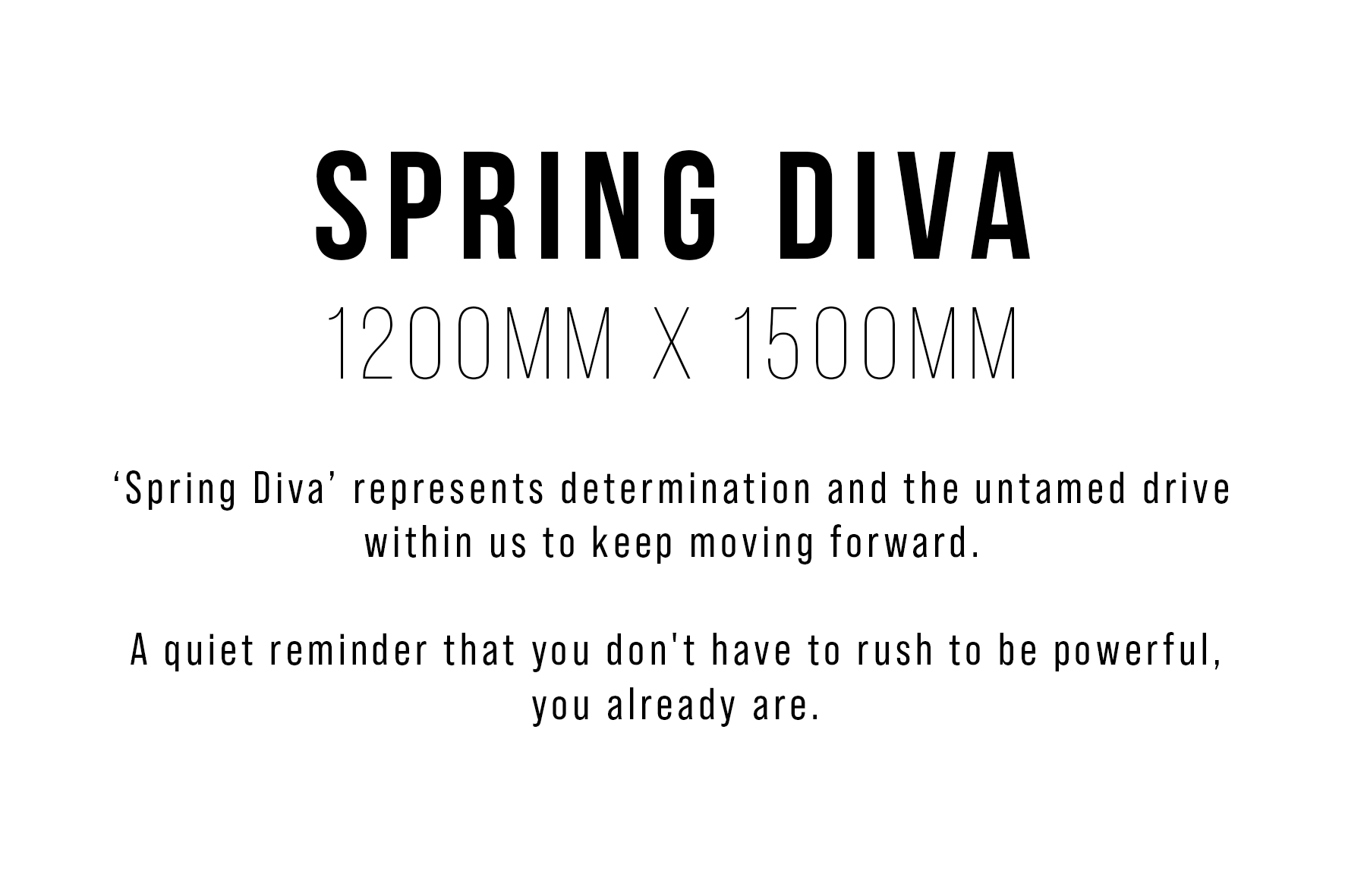
Version 1
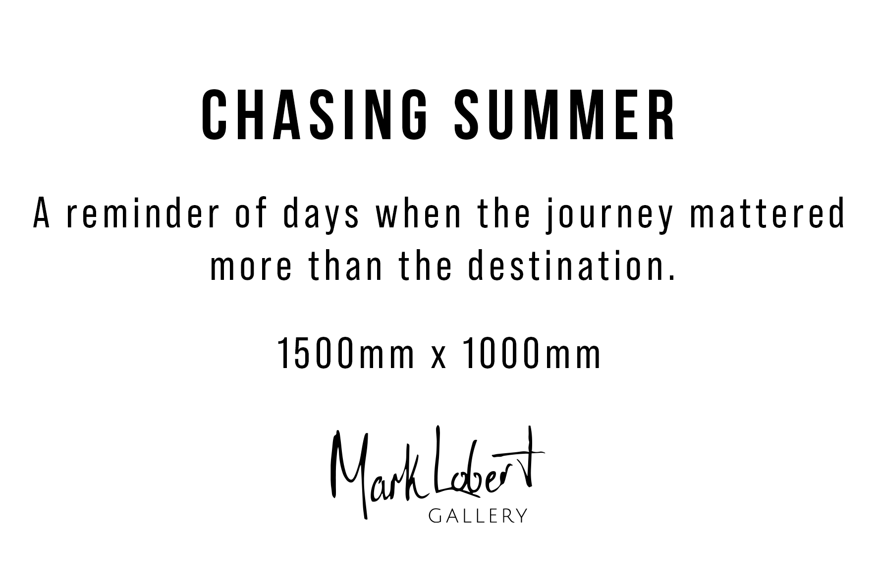
Version 2
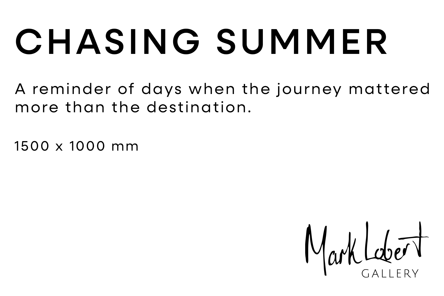
Version 3
Final Version
In the first version of the label, the painting dimensions took a lot of the focus yet it was the least important information. The text was restructured into a hierarchy in the second version, from most important to least important. The gallery logo was added because this card would be supplied with the painting. So if it was a gift and/or someone that didn’t attend the gallery looked at it they would see the gallery’s name and branding.
The remaining issue with the second version was that the centred layout took up too much space and only allowed for one sentence of the painting’s story. This was a problem as the story is one of the key selling points of the painting. To resolve this the text was aligned to the left in version 3.
Neulis Sans was selected as the final font because it’s a simple sans serif reminiscent of modern luxury brands, which is in line with the target audience being a fine art gallery in a trendy area. Given that the gallery’s logo is already two different fonts, it was decided that font pairing the title and body text would create too much variability. Therefore, Neulis Sans regular was used for the title and medium used for the body text to give it some variability while staying very similar.
The additional white space created by realigning the text also left space for a QR code to link to the gallery’s website. The gallery’s logo was placed on the left side of the final version so the information could be inhaled quickly with the last thing the eye lands on being the QR code.
deliverables
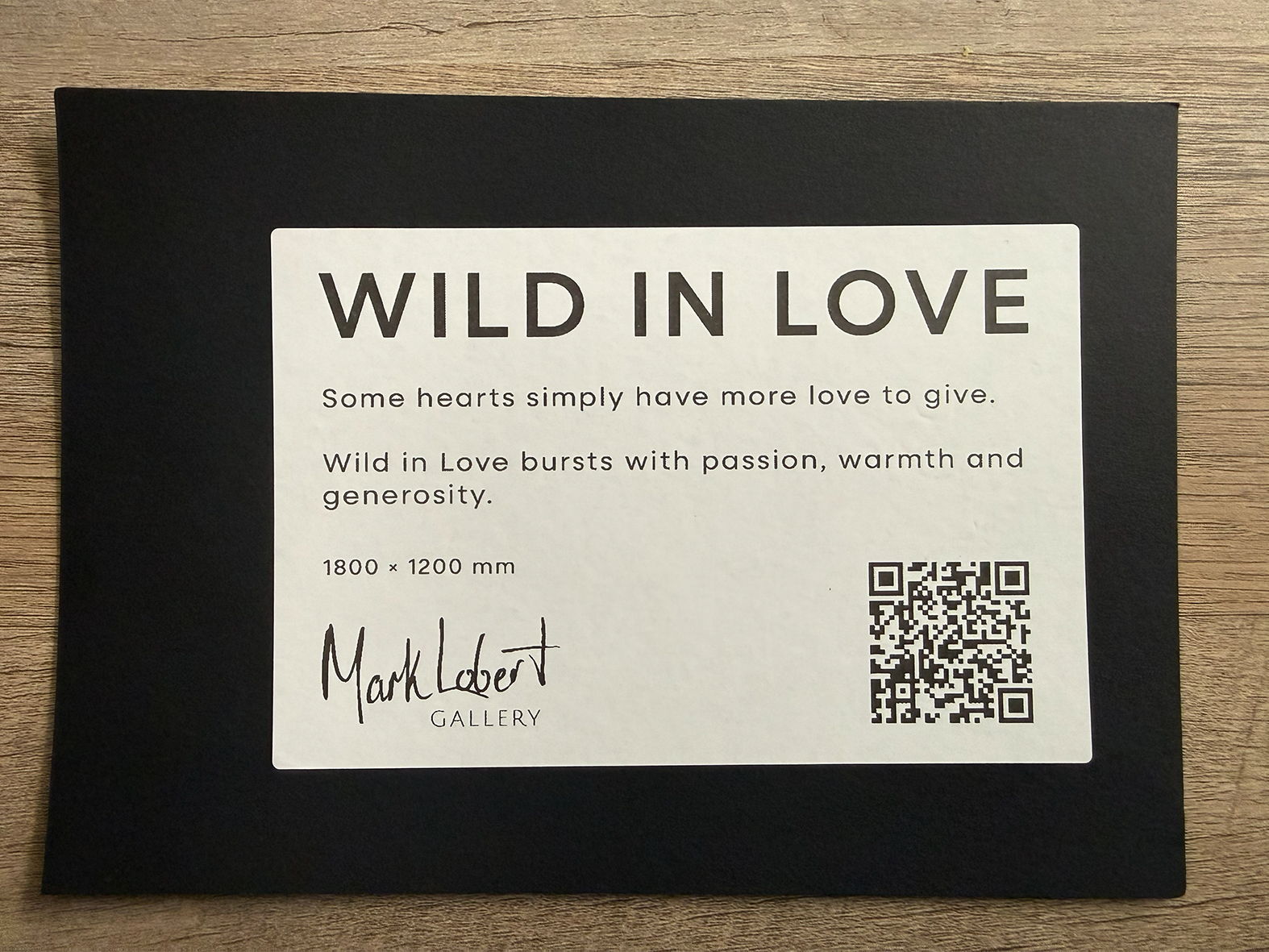
The final result was printed onto labels and placed on black cardboard for the client. The image needed to be exported vertically for the label printer, so Photoshop was used instead of Illustrator as it was the easiest method of rotating the canvas horizontally for editing then exporting vertically. This Photoshop file then served as a template for every painting label with a system in which you could easily replace the title, body and dimensions for each painting.
CASE STUDY 2: logo DESIGN
Brief: The client requested a butterfly logo in which the wings form the ‘E’ and ‘B’ of their business name, ‘Evolving Balance Counselling’.
REFERENCE
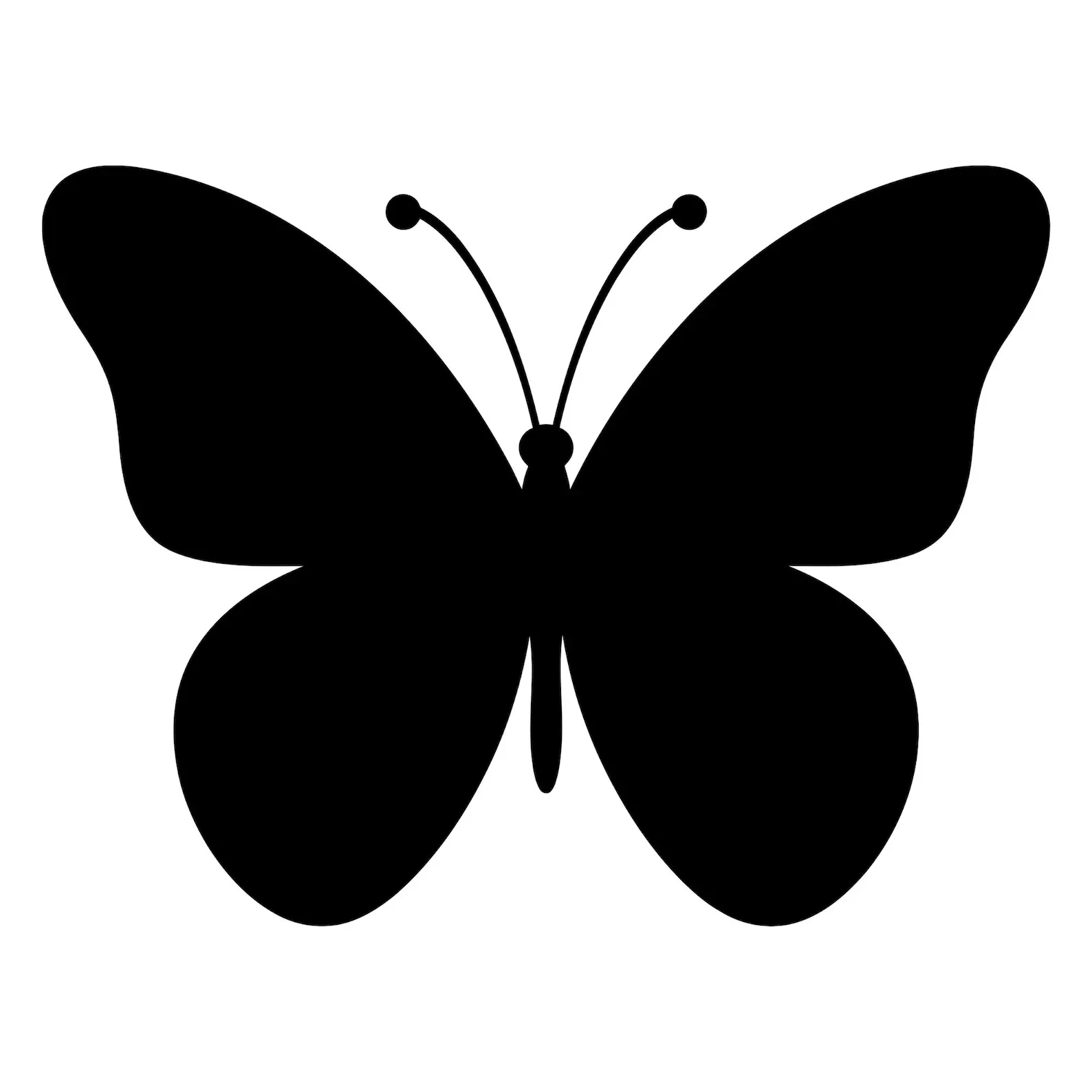
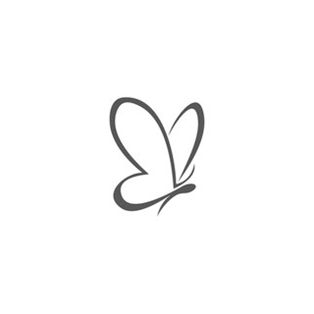
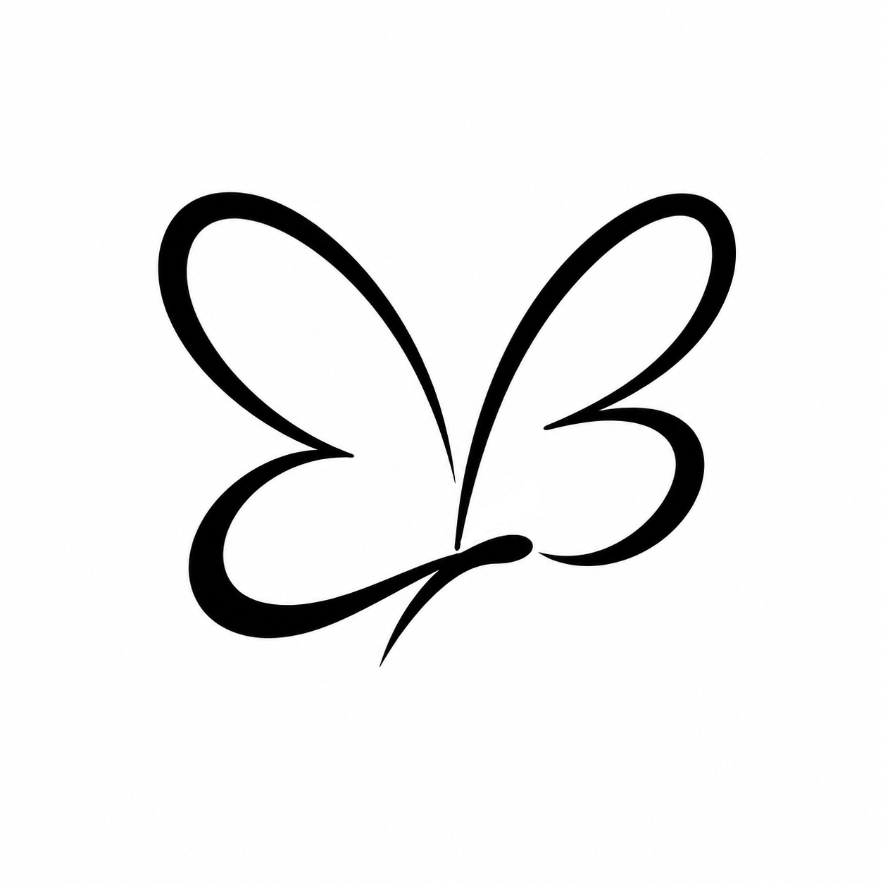
The concept stage began with searching for butterfly silhouette references for inspiration, followed by other examples of butterfly logos. Reference 2 was found on Adobe Stock and served as the main source of inspiration during the early conceptual stage.
Reference 1
Reference 2
EARLY CONCEPT
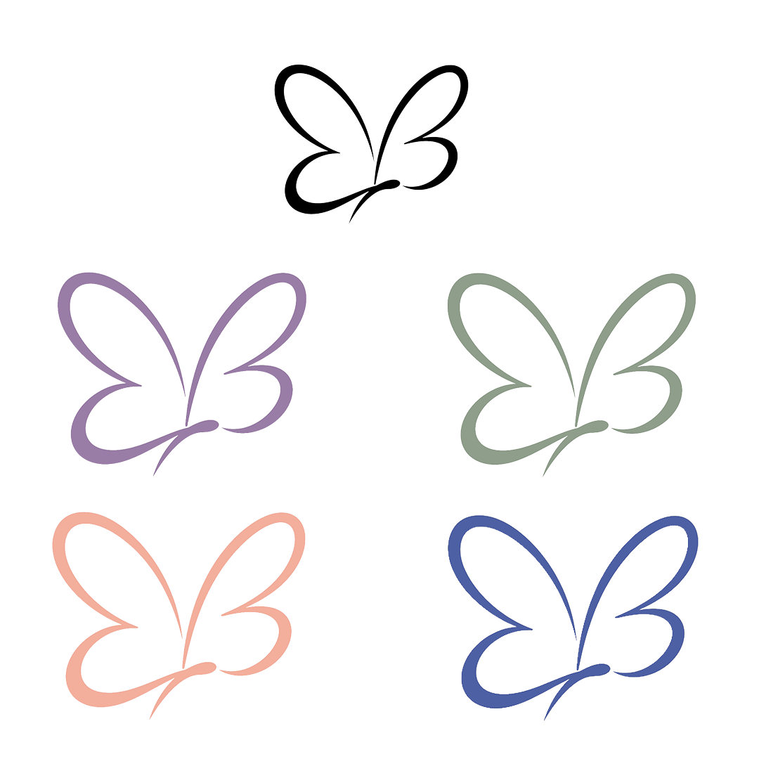
Generative AI was used to iterate on the design of Reference 2. The design below was the result of a few prompts. It was then taken into Photoshop, where colour variations were created for client feedback.
research
The research began with searching for colours associated with therapy and counselling brands. This led to the choices of purple, green, beige and blue, with muted tones selected to create a calm, gentle and emotionally safe aesthetic that feels approachable and professional.
I was particularly drawn to the purple, a colour often associated with introspection, calm and empathy. The client was also drawn to this version and chose to proceed with purple.
design DEVeLOPMENT
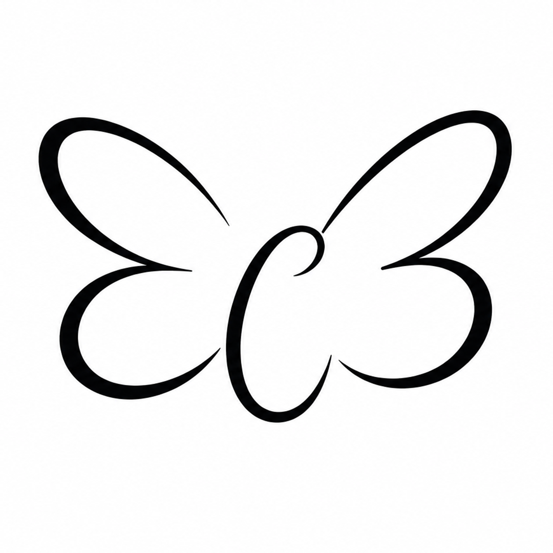
The raw output of the concept generated by AI had potential. However, there were some design flaws that left room for improvement. For example, the design was not symmetrical, the right wing was slightly higher than the left, and the tapers on the wings were inconsistent.
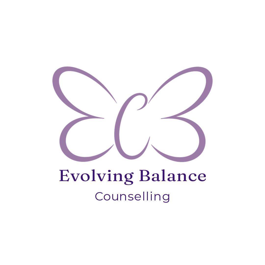
To improve the design, it was converted to vector using an Image to SVG model in Figma Weave, then brought into Adobe Illustrator for refinement. The geometry was coloured purple before the ‘C’/body was repositioned more centrally, as requested by the client. The right wing was deleted, and the left wing was duplicated, mirrored vertically, and aligned with the original to achieve symmetry.
The client requested that the body of the butterfly be in the centre and asked if it was possible that it forms a ‘C’ for ‘Counselling’.
A rough sketch of the concept was made and given to generative AI to create another iteration of the concept.
Raw AI Output

Vector Refinement
FINAL design
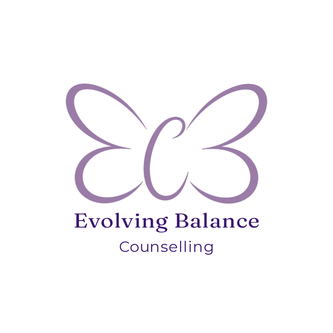
To finalise the design the business name text was added. The ‘Fraunces’ font was chosen for the main text as the softer, slightly quirky letterforms complement the organic butterfly. The ‘Montserrat’ font was chosen for the secondary text as it has a clean and modern look that is highly legible. It worked well to increase the letter spacing, creating a feeling of space and calm. The serif + sans pairing gave it a much clearer hierarchy as the eye is now drawn towards the business name first then counselling follows to provide context.
social media graphics
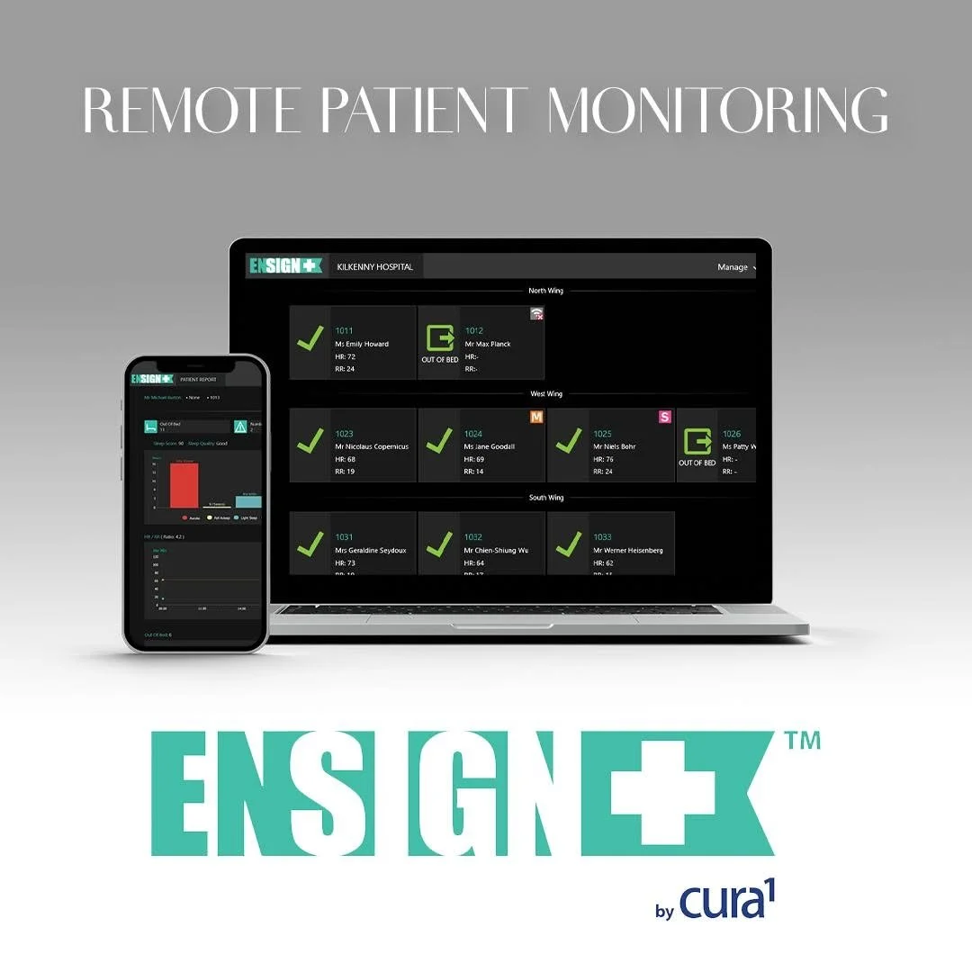
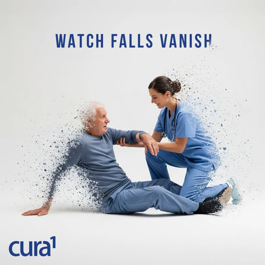
PRINT DESIGNS
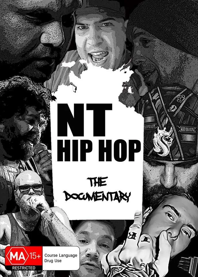
DVD Cover Artwork
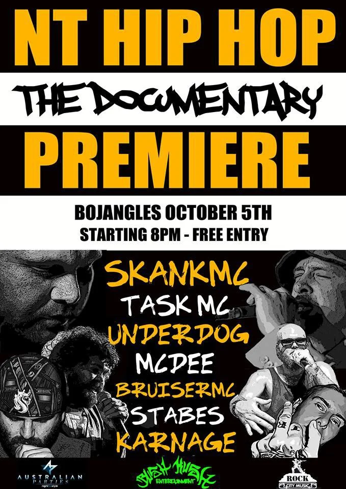
Concert Poster Design